The Art of the In-Between
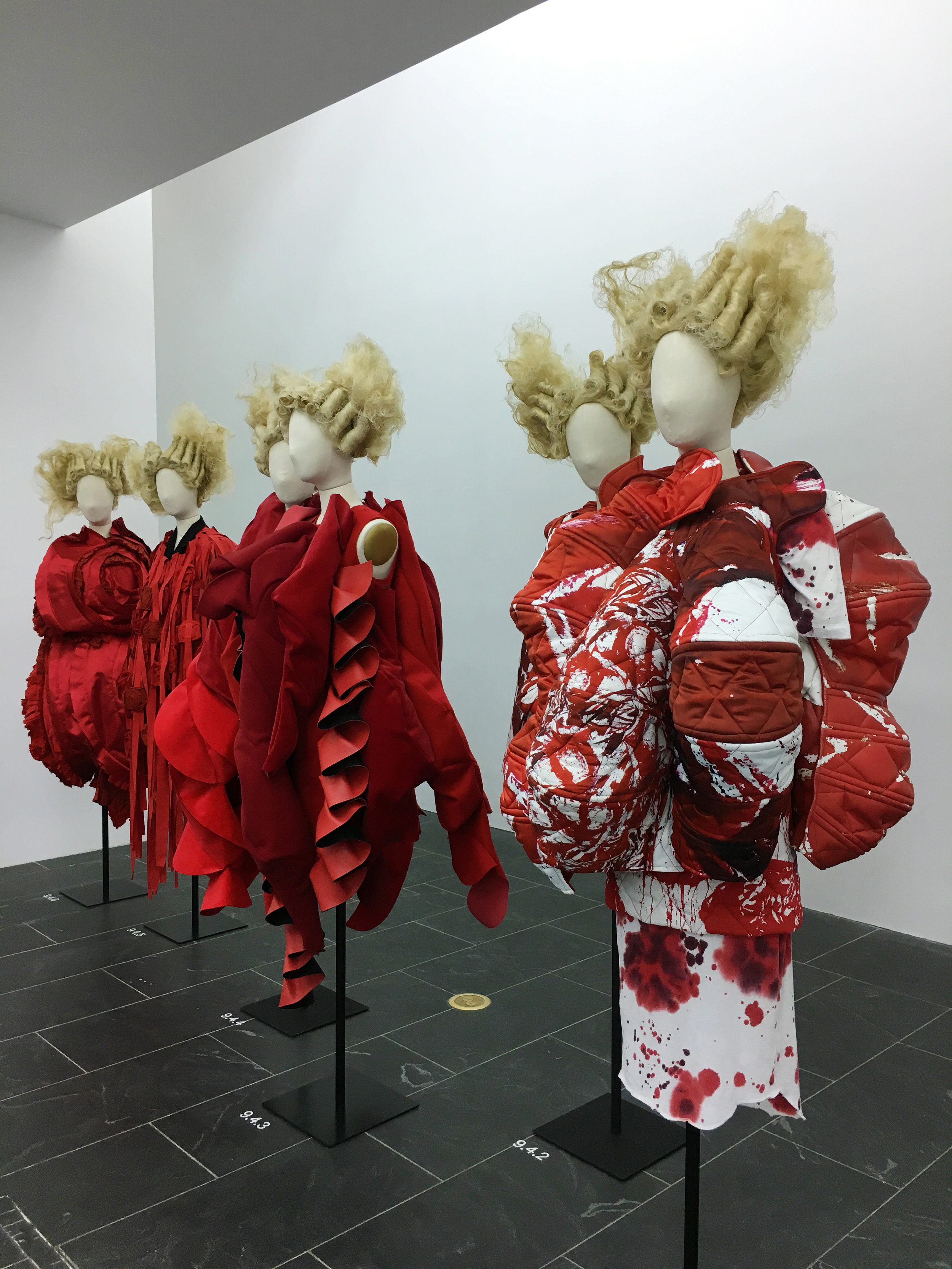
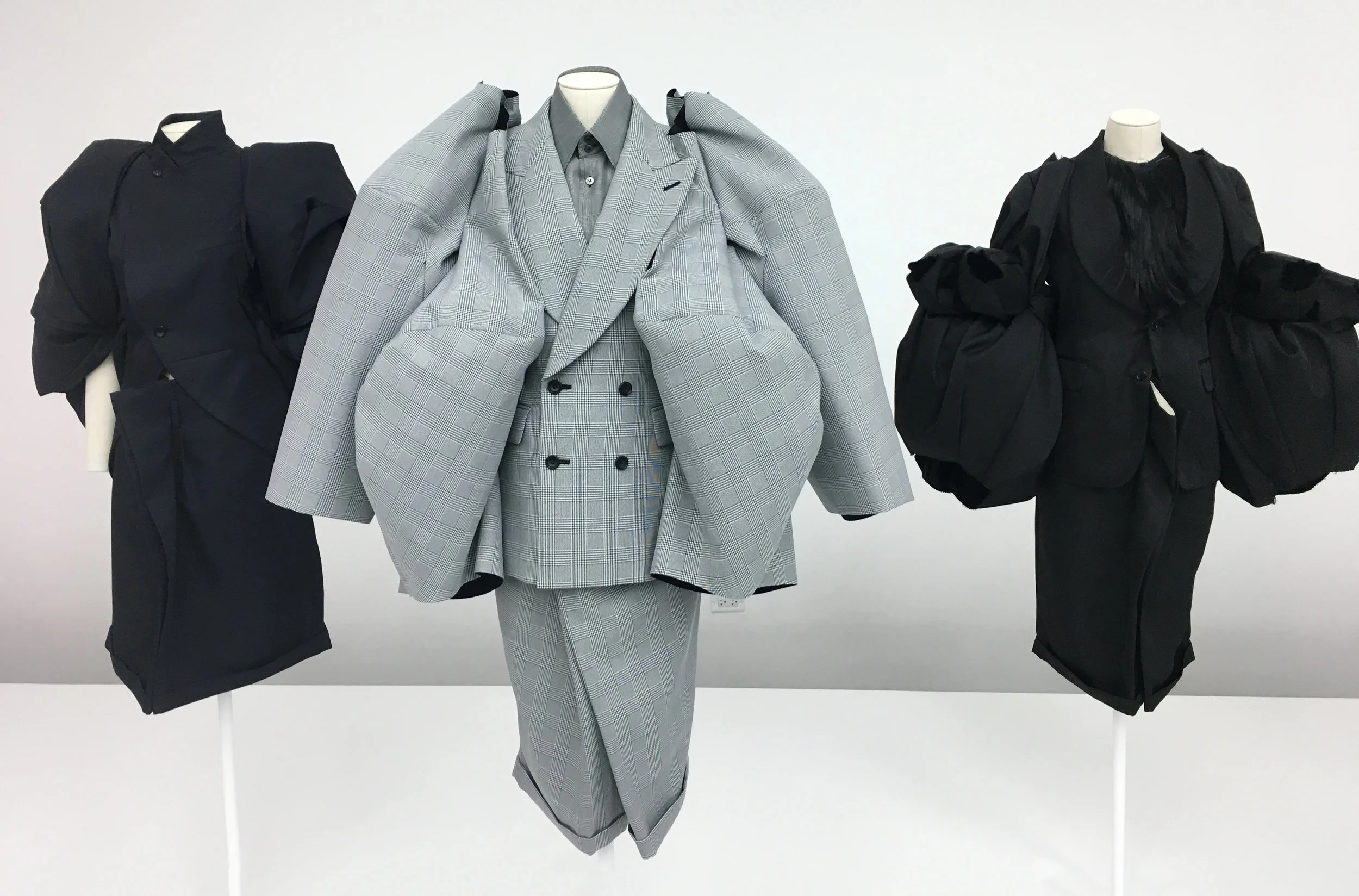
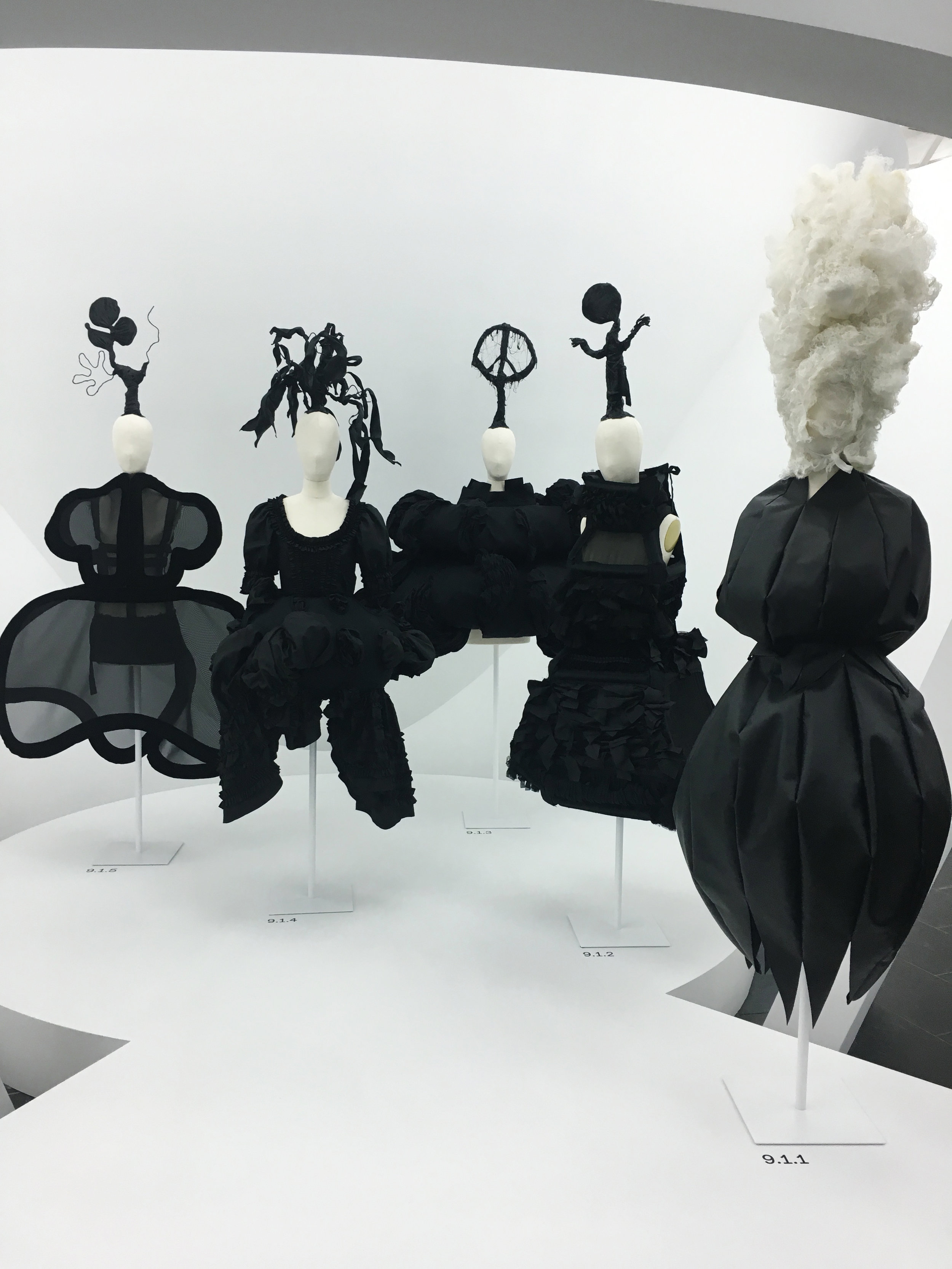
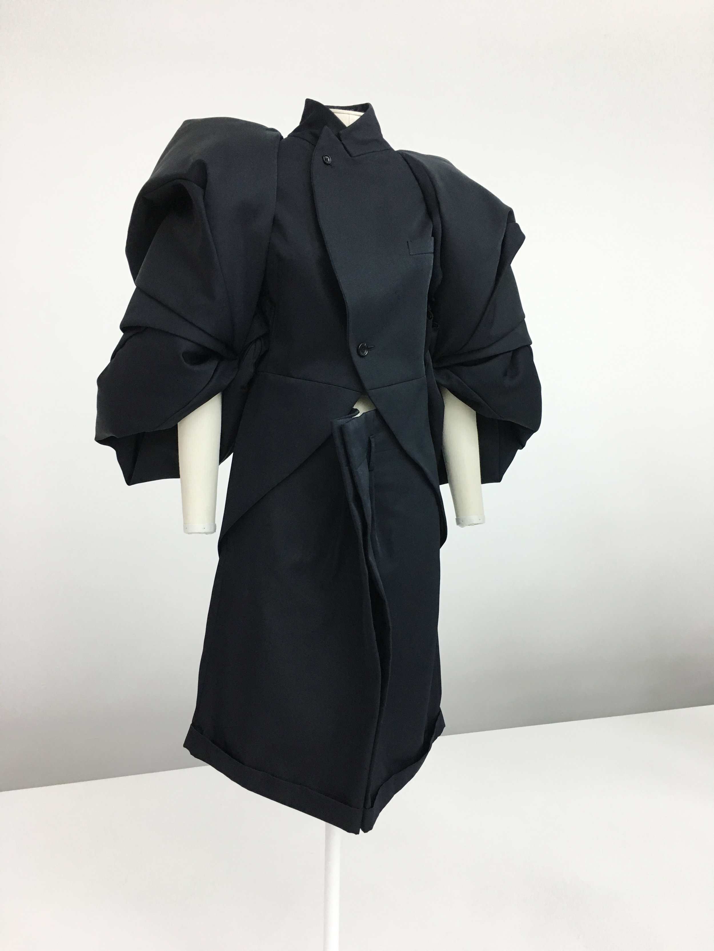
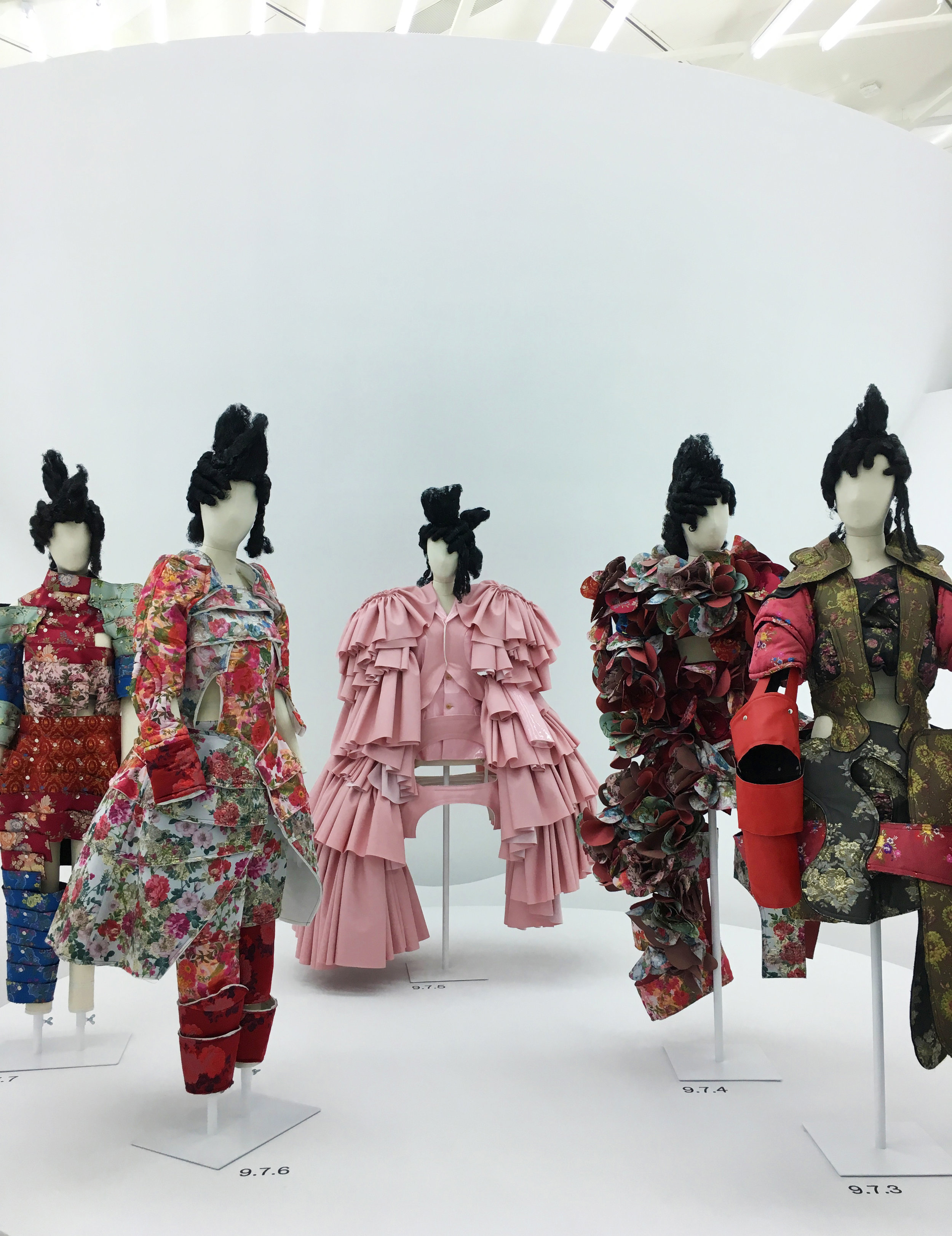
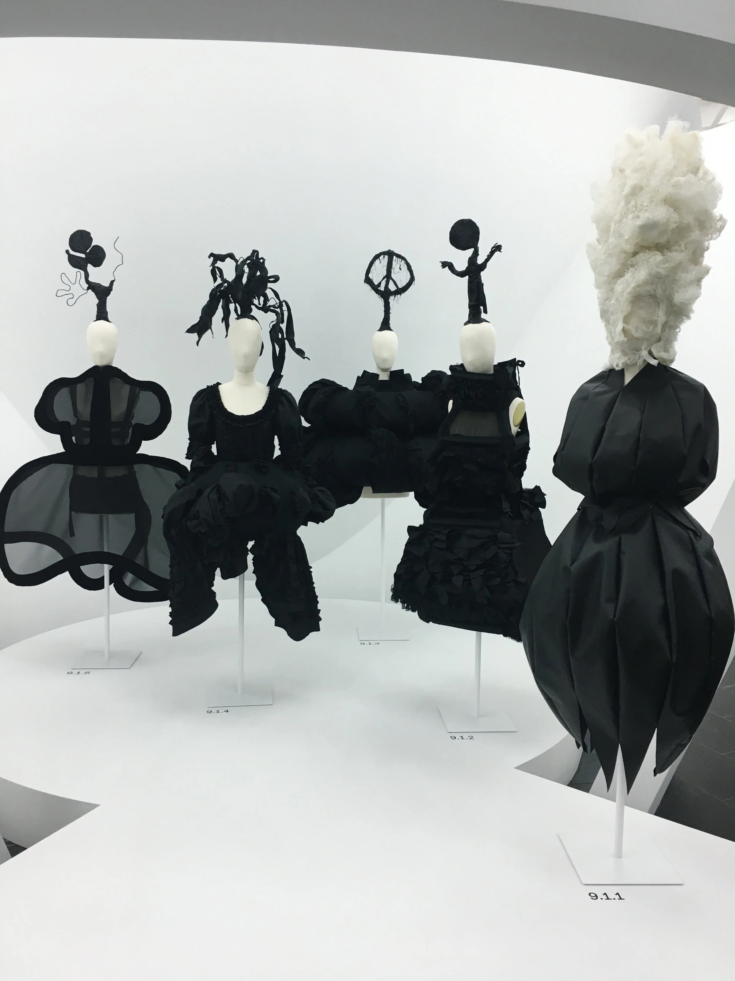
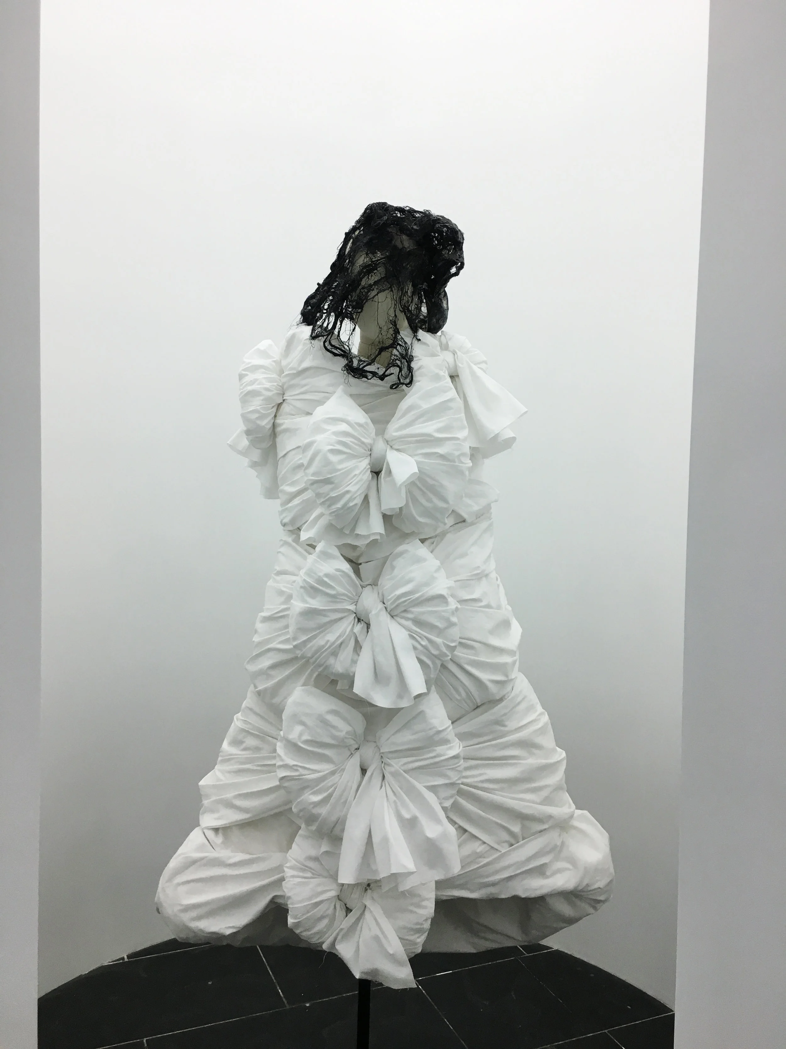
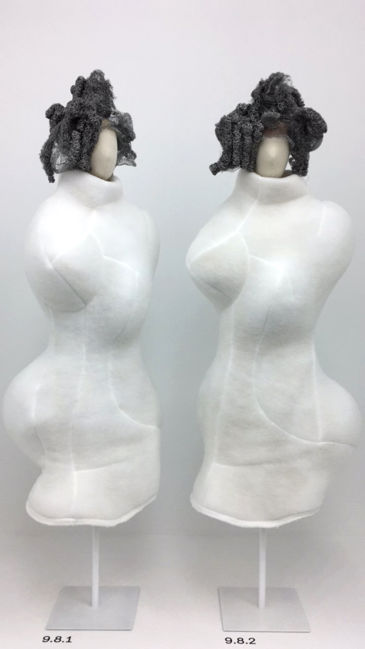
New York’s Metropolitan Museum of Art (The Met) has a stunning exhibition of famed fashion designer Rei Kawakubo’s work. Of course, she is synonymous with Commes des Garcons, and The Met has put together a really intriguing exhibition that looks at opposites in her work. It blurs the lines of what we think opposite means and looks at what’s in between. It is the essence of what she has done since founding Commes de Garcons in 1969 -- embracing two Japanese principles: mu (emptiness) and its relation to ma (space). The concept of opposites blurring invokes the space in between.
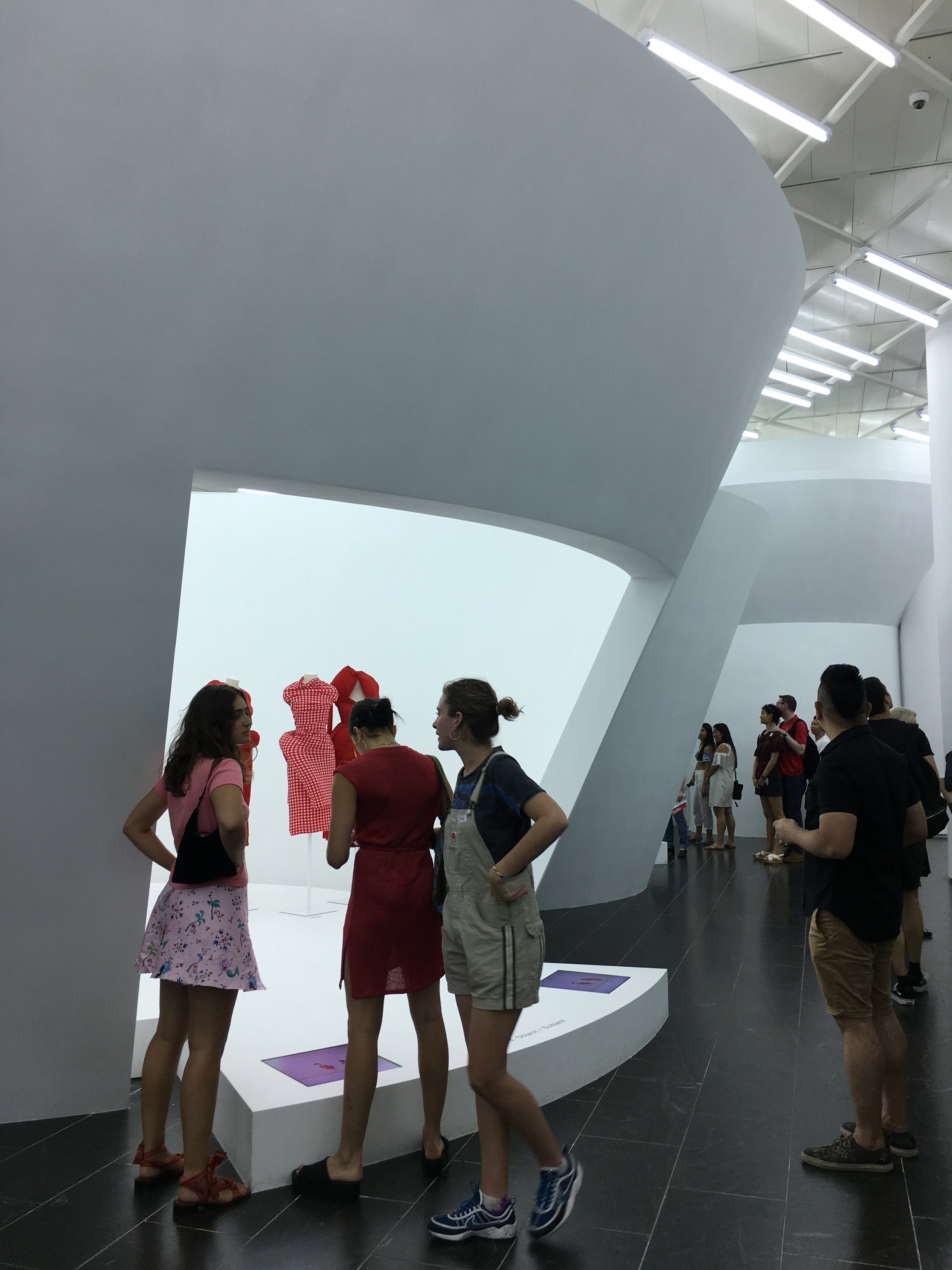
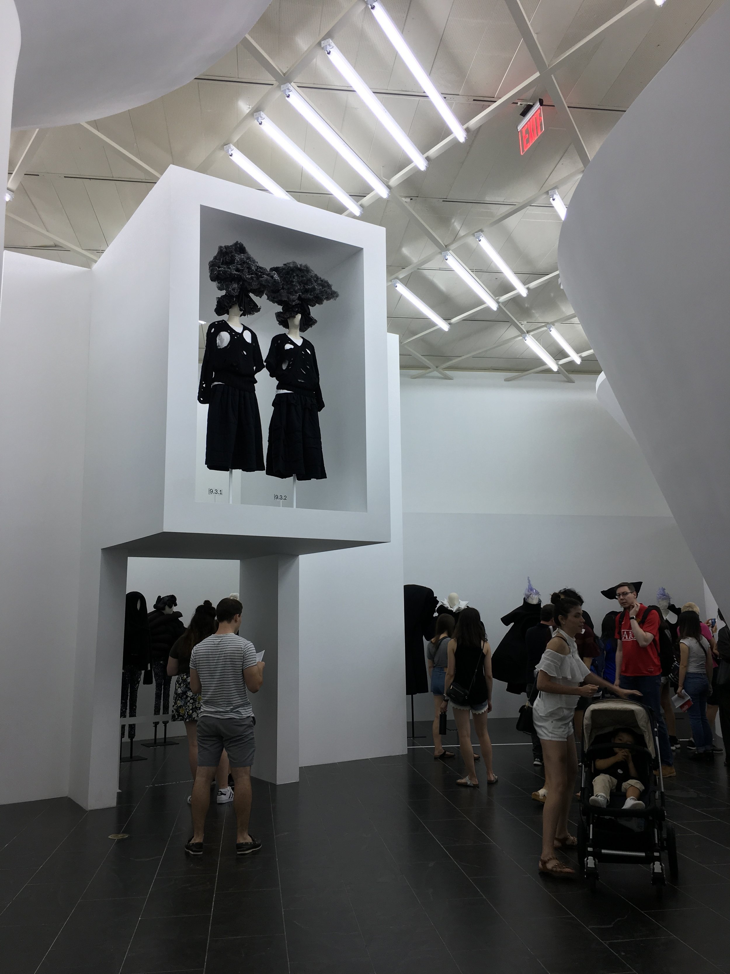
As always,we were really impressed by Kawakubo’s body of work as well as the great manner in which the exhibit was curated and designed. We’ve been to other shows in the Costume Institute at The Met that were stunning, but they were typically staged in dramatic setting with more direct lighting, to great effect. But Kawakubo’s work was portrayed entirely different. The staging was white with a matrix of overhead lighting from the ceiling and no spot-lighting on the displays. It emphasized the bold shapes of Kawakubo’s work, reflecting the colors and theme of the exhibit as well as her design ethos..
There are several concepts of “in-betweenness” portrayed in the exhibition and we could go into great detail about each, but I think the visuals tell the story.
